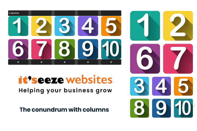
Responsive websites, columns and breakpoints

Responsive website design - Columns 

Responsive websites are great, you design your website, add the content and let the web browser and the server adjust the content so that it is displayed on any size screen effortlessly. It looks great on your computer, then you pick up your phone to admire your latest edits, and what you see is not what you might expect... Why? 
 
A website is laid out in a series of rows, divided into columns into which content is added: 
Responsive website design Itseeze camberley
when the screen size (or more strictly the view-port size) changes, to go from a wide screen desktop to a mobile phone the software that runs the website serves the content according to a set of rules, applying formula to the columns to determine how they are displayed.  
 
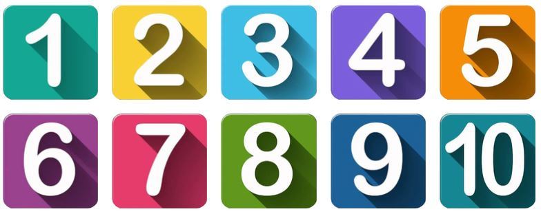
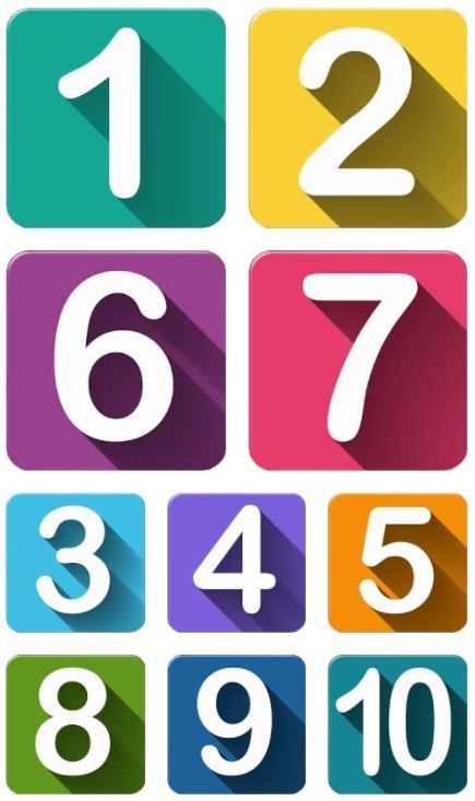
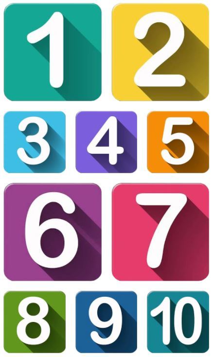
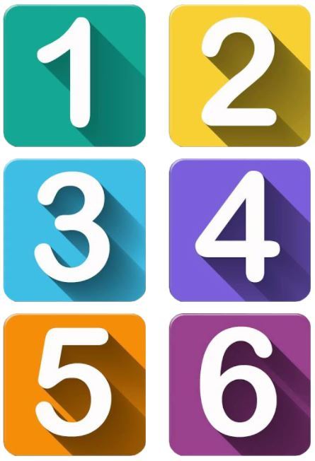
We read content from left to right, and from top to bottom. the responsive website software reads columns from left to right, and reads each column from top to bottom in turn. Lets look at an example, which could be a sequence of photographs in a website gallery, or content laid out logically. On the face of it these two layouts appear the same on a desktop computer 

Website column layout 1 

This layout has one row of five columns into which the images are placed in a continuous sequence 
Responsive website layout example #1 Responsive website layout example #6
Responsive website layout example #2 Responsive website layout example #7
Responsive website layout example #3 Responsive website layout example #8
Responsive website layout example #4 Responsive website layout example #9
Responsive website layout example #5 Responsive website layout example #10

Website column layout 2 

This layout has two rows of five columns each row / column combination having one image in it. 
Responsive website layout example #11
Responsive website layout example #12
Responsive website layout example #13
Responsive website layout example #14
Responsive website layout example #15
Responsive website layout example #16
Responsive website layout example #17
Responsive website layout example #18
Responsive website layout example #19
Responsive website layout example #20
If you are viewing this on a view port which is XS or smaller, the next two layouts are images as would be displayed on a wide screen PC 

Website column layout 1 

This layout has one row of four columns into which the images are placed in a continuous sequence 
Responsive website column layout example #1

Website column layout 2 

This layout has two rows of five columns each row/ column combination having one image in it. 
Responsive website column layout example #2

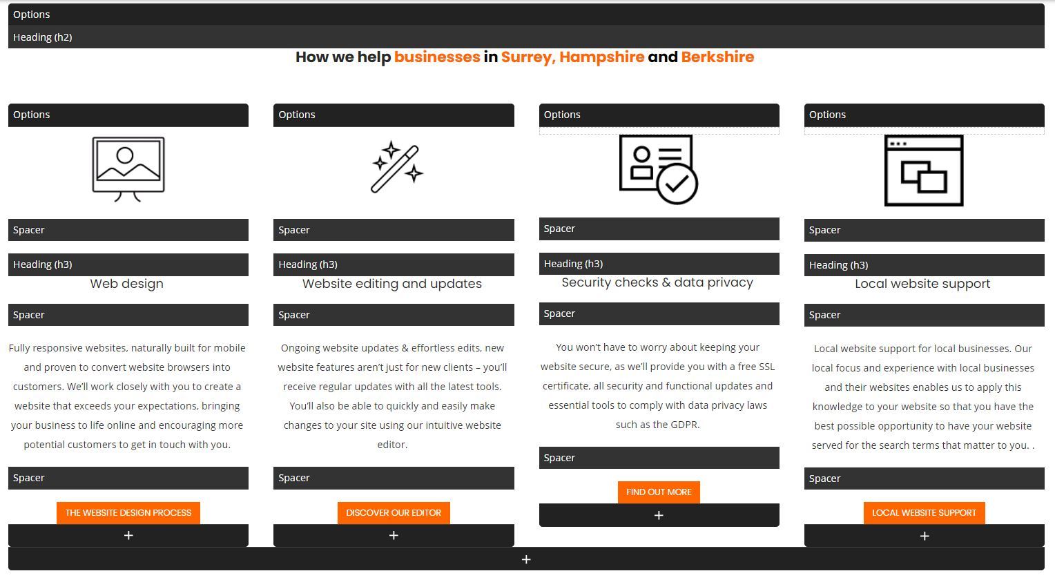
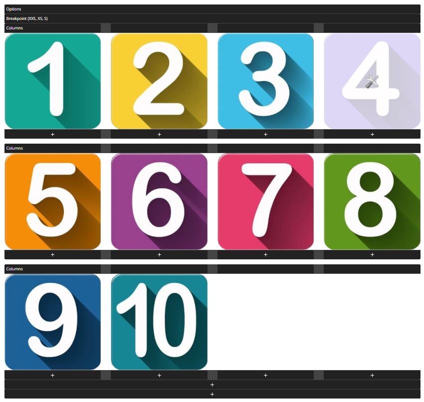
But what happens when this is viewed on a mobile device with an XS view port or smaller? 

Website column layout 1 displayed in XS view port 

The content is displayed so that it is visible, but in the wrong order and in different sizes 
Responsive website column layout XS Viewport #1 Responsive website column layout XS Viewport #6
Responsive website column layout XS Viewport #2 Responsive website column layout XS Viewport #7
Responsive website column layout XS Viewport #3 Responsive website column layout XS Viewport #8
Responsive website column layout XS Viewport #4 Responsive website column layout XS Viewport #9
Responsive website column layout XS Viewport #5 Responsive website column layout XS Viewport #10

Website column layout 2 displayed in XS view port 

The content is displayed so that it is visible, in the correct order in different sizes. This may or may not be an issue, if it is then the use of the break point element will rectify this  
Responsive website 2 column layout XS Viewport #1
Responsive website 2 column layout XS Viewport #2
Responsive website 2 column layout XS Viewport #3
Responsive website 2 column layout XS Viewport #4
Responsive website 2 column layout XS Viewport #5
Responsive website 2 column layout XS Viewport #6
Responsive website 2 column layout XS Viewport #7
Responsive website 2 column layout XS Viewport #8
Responsive website 2 column layout XS Viewport #9
Responsive website 2 column layout XS Viewport #10

Layout 1  

The content is displayed so that it is visible, but in the wrong order and in different sizes 
Responsive website 2 column layout 1 XS Viewport

Layout 2 

The content is displayed so that it is visible, in the correct order in different sizes. This may or may not be an issue, if it is then the use of the break point element will rectify this  
Responsive website 2 column layout 2 XS Viewport #

Using a break point to display images of uniform size in an XS view port 

By creating a break point that is only visible on certain view port sizes the website layout can be altered to display how you want it to display on any of the view port sizes available, ensuring that the website visitor is presented with the information in the way that you want it to be displayed every time. 
Responsive website breakpoint view
By creating a layout within a break point in the website editor, the images can be displayed both in the correct order and also with a uniform size. 
 
This rule applies to any content, not just website images. It could be sections of text or buttons that need to be presented in a particular way.  
 
The power of using Itseeze break points enables you to achieve this. 
Responsive website with 2 column layout XS Viewport
By creating a layout within a break point in the website editor, the images can be displayed both in the correct order and also with a uniform size. 
 
This rule applies to any content, not just website images. It could be sections of text or buttons that need to be presented in a particular way.  
 
The power of using Itseeze break points enables you to achieve this. 
Responsive website 2 column layout XS & S Viewport #1
Responsive website 2 column layout XS & S Viewport #2
Responsive website 2 column layout XS & S Viewport #3
Responsive website 2 column layout XS & S Viewport #4
Responsive website 2 column layout XS & S Viewport #5
Responsive website 2 column layout XS & S Viewport #6
Responsive website 2 column layout XS & S Viewport #7
Responsive website 2 column layout XS & S Viewport #8
Responsive website 2 column layout XS & S Viewport #9
Responsive website 2 column layout XS & S Viewport #10

Web design, content generation and SEO from Itseeze Camberley 

If you need a new responsive website, advice on how to edit your Itseeze website, a cost effective means of monitoring the performance of your It'seeze website or tailored SEO packages please use the contact form below, call us on 01276 501285 or click on the "book an appointment" button to schedule an in person meeting or zoom call via our calendar management system. 
or please fill out the form 
Please tick all that apply: 
The it'seeze customer support website provides a wealth of information and "how to" videos to help you maintain your website and utilize the features available to you. It can be accessed by clicking the logo below: 
It'seeze Camberley - website design for companies in Surrey, Hampshire and Berkshire including Camberley, Farnborough, Aldershot, Fleet, Farnham, Guildford, Woking, Bagshot, Sandhurst, and Wokingham. 
Share this post:
Our site uses cookies, including for advertising personalisation. For more information, see our cookie policy. Accept cookies and close
Reject cookies Manage settings