


What is a responsive website?
Responsive website design - mobile friendly
The term "responsive website design" is one that you will have seen if you searched Google for the expressions " Web design Camberley " or " Web design Farnborough " and clicked through to investigate further, but what does it mean, and why is it important?
Google is primarily responsible for the shift to responsive websites. As mobile devices became more widespread, websites that we written for computers could not be viewed properly on a much smaller screen without zooming in or out (or pinching). Web design companies would therefore produce one website for a desktop computer, and a different website for mobile devices, twice the work, twice the cost.
Google announced in 2015 that from April 21st that year it would be expanding its use of mobile friendliness as a ranking signal. Everyone took notice, and the responsive era was born.
Responsive websites adapt themselves to the screen size (or view port) that they are being shown on, the browser that you use reports the view port size to the website server, and content is displayed accordingly. Itseeze websites go one step further, you can actually display up to six different versions of your content should you so wish depending on the view port size ... but more of that later.
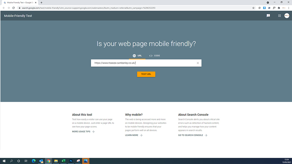
Google's Mobile Friendly Test
To "assist" website owners to determine whether their website would be considered "mobile friendly" by the Google crawler, Google added a checker facility into their webmaster / search console software.
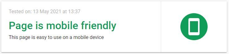
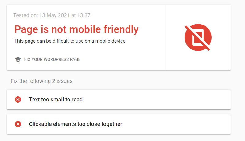
Hopefully the response is that the page you are testing is mobile friendly, and you are presented with a nice green message and icon, should it fail the test, the reasons why will be listed, and should be corrected as this will be impacting your ranking and ability to be found by your potential customers
Why should your website be responsive?
Google use the mobile ready test as a ranking signal
Responsive websites load faster than "mobile only" websites,
page load speed is also a ranking factor for Google.
According to Google 40% of website users abandon a website if it takes more than 3 seconds to load
Responsive websites will display on any screen size without the viewer needing to re size the content
A responsive website is easier to maintain and optimize for searches than a desktop and a mobile website.
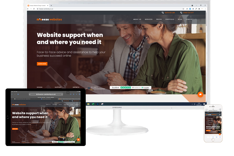
All Itseeze websites are fully responsive and mobile friendly
Break Points
All Itseeze websites are designed to be fully responsive. This means that the content will adapt to whatever screen size it is being shown on according to the rules of the website code running behind the scenes.
Occasionally these rules need to be overridden so that the web page is displayed in a manner that is appropriate to the screen size and this is done by setting break points. A break point is a component that affects what is to be displayed for a particular screen size or sizes.
Break points can be added during the design phase of your website, or at any subsequent point during website editing.
The Itseeze break point component
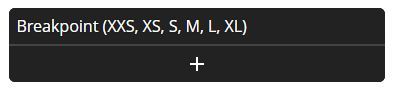
The Itseeze break point component provides six different screen widths, these relate to the size of the viweport NOT the resolution of the screen.
|
XXS |
Minimum Width |
Maximum Width |
|
XS |
— |
431 pixels |
|
S |
432 pixels |
575 pixels |
|
M |
576 pixels |
863 pixels |
|
L |
864 pixels |
1151 pixels |
|
XL |
1440 pixels |
1728 pixels |
Why use breakpoints with a responsive website?
Sometimes it makes sense to display different content on different screen sizes, a large screen may display large amounts of text effectively, but smaller screen sizes may benefit from less text and more graphics, or the elements of the page displayed in a different order.
A smaller screen size may require content to be displayed in a different order, breakpoints allow you to specify this, giving you complete control over how your website is presented.
Web design, content generation and SEO from Itseeze Camberley
If you need a new responsive website, advice on how to edit your Itseeze website, a cost effective means of monitoring the performance of your It'seeze website or tailored SEO packages please use the contact form below, call us on 01276 501285 or click on the "book an appointment" button to schedule an in person meeting or zoom call via our calendar management system.
or please fill out the form
The it'seeze customer support website provides a wealth of information and "how to" videos to help you maintain your website and utilize the features available to you. It can be accessed by clicking the logo below:

It'seeze Camberley - website design for companies in Surrey, Hampshire and Berkshire including Camberley, Farnborough, Aldershot, Fleet, Farnham, Guildford, Woking, Bagshot, Sandhurst, and Wokingham.
Share this post: